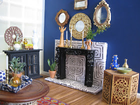
This room was inspired by a navy blue sofa I saw in a Z Gallerie advertisement. I had to have it, so make-it-mini! So, I made this little sofa and in the process, I learned so many "what not to do's". Trial and error. I also made the chair and once again, I learned some little lessons (little, get it?). I made this bar cart last year while I was on hiatus and never got around to putting wheels on it. Just recently, I purchased a brass one to use in the future. The pattern behind the fireplace is a photo copy of a Nate Burkus tile (wrapped around foam core) that I bought at Target. The tile itself was too large to use. The rug is made from strips of trim sewn together. So, do you remember the unfinished dollhouse hutches that you could find at Michael's for a couple of bucks? There were about three different styles. Well, that's what the black cabinet is in the corner. I separated the top from the bottom. When I realized that they weren't restocking these little goodies, I bought about 10 of them from three different Michael's in the area.
This room has a collected flea market look, nothing matches, there's a lot of pattern and there are lots of global items. Sophisticated Bo ho, that's what I'm calling it.
 |
| Mine |
 |
| Z Gallerie |
That's it for now, I plan to start my X-mas scene now....yeah right! No really, I'm seriously thinking about it.
Blessings to everyone.... Beany


Love it! So much to see and take in. Your details are spectacular.
ReplyDeleteThank you! I love details and it's what I'm drawn to in real life scenes and mini scenes.
DeleteGreat job on the sofa, the blue is fabulous! Your scenes are always vibrant and warm. Love it!
ReplyDeleteThank you so much! The sofa was fun to work on. I'll be attempting a different one for a X-mas scene.
DeleteWow, that blue is gorgeous. Don't you think it is a fantastic backdrop for metallics? I prefer your sofa too. It looks far more comfortable and luxurious =0) Beautiful scene.
ReplyDeleteThank you Pepper, and I do agree that the brass looks great against that deep blue.
ReplyDeleteI dont know what i love more your taste or your creativity...Ok..its a tie! Love this room! BTW I am the same about blue. Love it in mini but not in my house. Shruggin my shoulders.\o/
ReplyDeleteOh, you're too kind! Thank you. Interesting how we can love colors, but don't want them in our house. I wear a lot of blue, but have NEVER EVER used it at home.
ReplyDeleteLove the whole room - so many details to take in. Your blue couch is so luxurious - and much better than its inspiration. I'm so impressed at your design sense and ability to pull this all together. And I like what you did with the Michael's cabinets. Anyway I once did paint a very small bathroom a similar color blue. I think it worked, but then I renovated it and I went with light green tile and sand-colored walls. Looking forward to your Christmas scene! I might just start working on mine now too.
ReplyDeleteThank you! Your reno sounds beautiful, I love sand colored walls, my house is full of them!
DeleteGREAT scene and the Dark Blue IS sexy! Love the way you mix and match the variety of textures and unify everything by repeating color in larger or smaller increments. To be able to combine so many disparate items and have them all work so well together takes both talent and skill and you have NAILED it Beautifully! :D
ReplyDeleteThank you! This room actually reflects my personal style, except there's no blue in my world.
ReplyDelete